

Frank Ocean
Promotional series
For this project, I was inspired to bring my love of printmaking and design together to create unique imagery that encaptures the feelings and emotions behind each song as a whole. His music is mostly described as musically unconventional, electro-funk, pop-soul, jazz-funk, and psychedelic. His songwriting explores themes of unrequited love, decadence, social class, and drugs, through the use of surrealistic imagery, conversational devices, and descriptive narratives depicting dark characters. THIS PROJECT WAS HEAVILY FOCUSED ON WORK IN ADOBE ILLUSTRATOR, ADOBE INDESIGN & ADOBE PHOTOSHOP
WHILE USING PRINTMAKING AND FINE ART TECHNIQUES

As a die-hard fan myself (that would potentially sell a kidney to see Frank Ocean live in concert), I believed he has been long overdue for another album release; and what better way to commemorate that “new album excitement” than to rebrand and re-release his first album entirely?
ALBUM POSTERS
ZINE AND BOOKLET PACKAGING

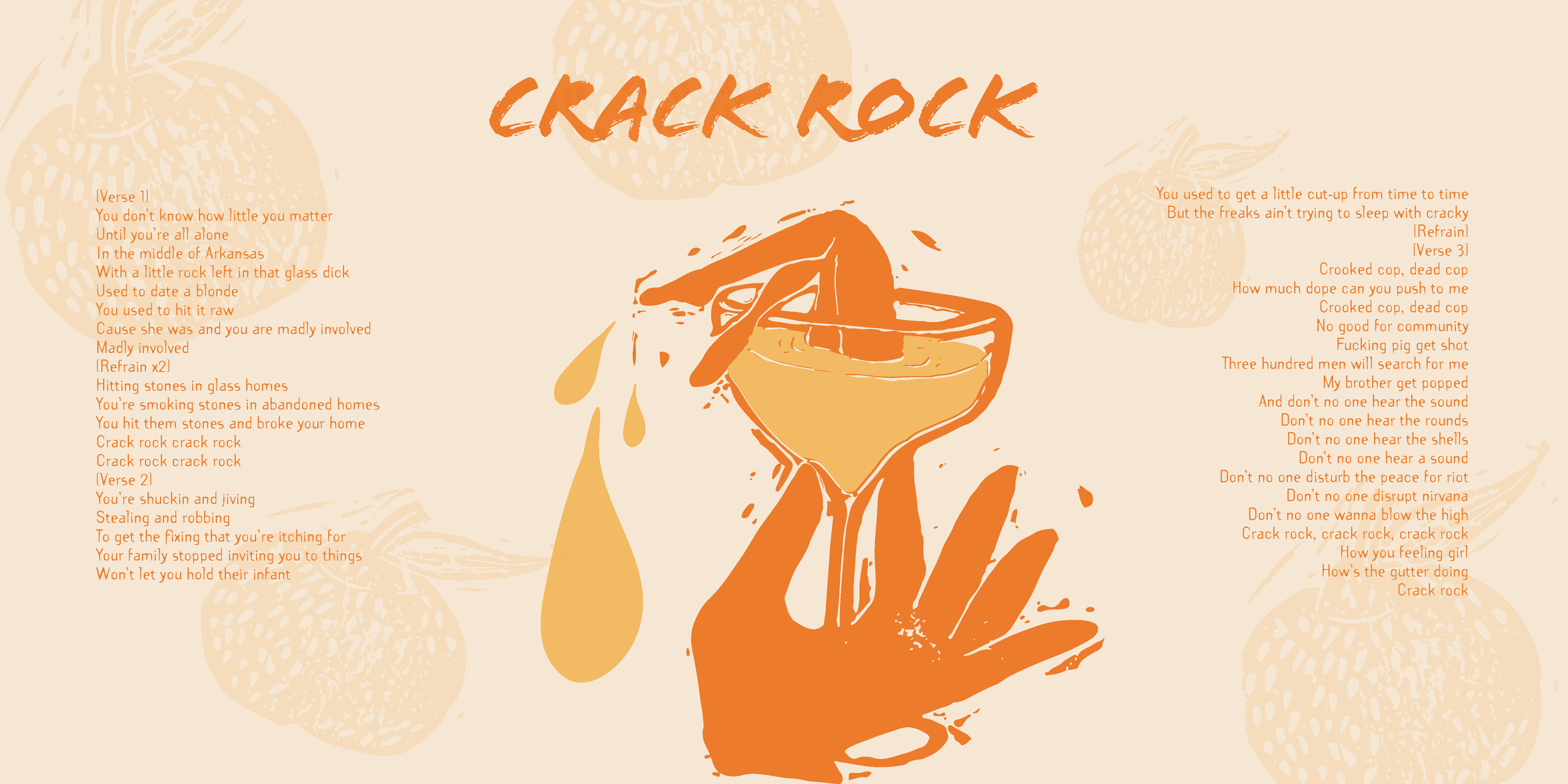
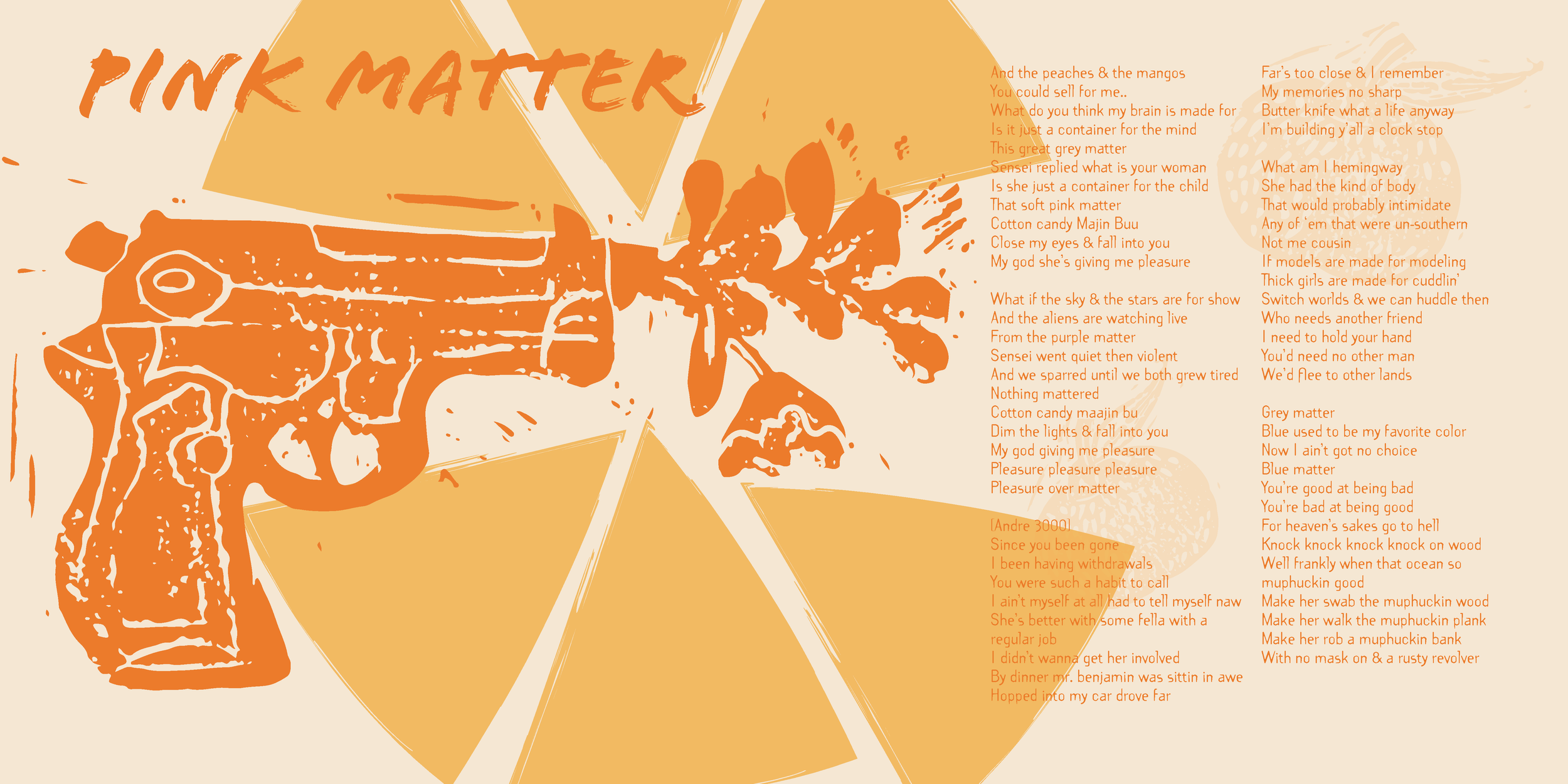
ZINE

VINYL
Project summary
This project began as a collectible Lyric Zine made in tribute to the 10-year anniversary re-release of Frank Ocean's album, Channel Orange. The package now includes two posters, a booklet with facts about the artist, and the album on vinyl. It aims to appeal to current fans and introduce Ocean's work to new potential fans. The challenge was to create a Zine with imagery that evokes the same feelings as the album songs. The solution was to incorporate printmaking, as the intentional process reflects the layers within Ocean's music.

printmaking process
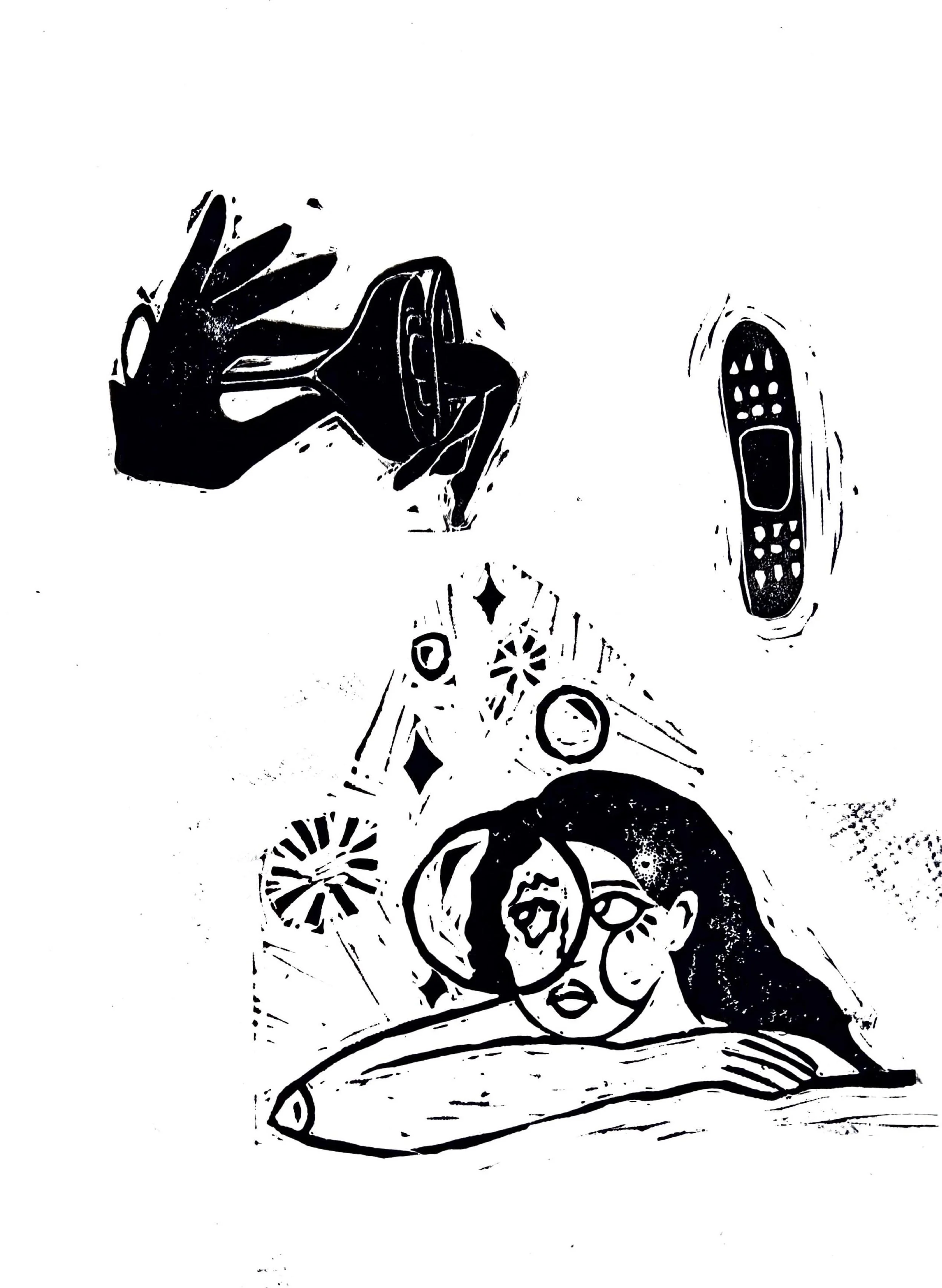
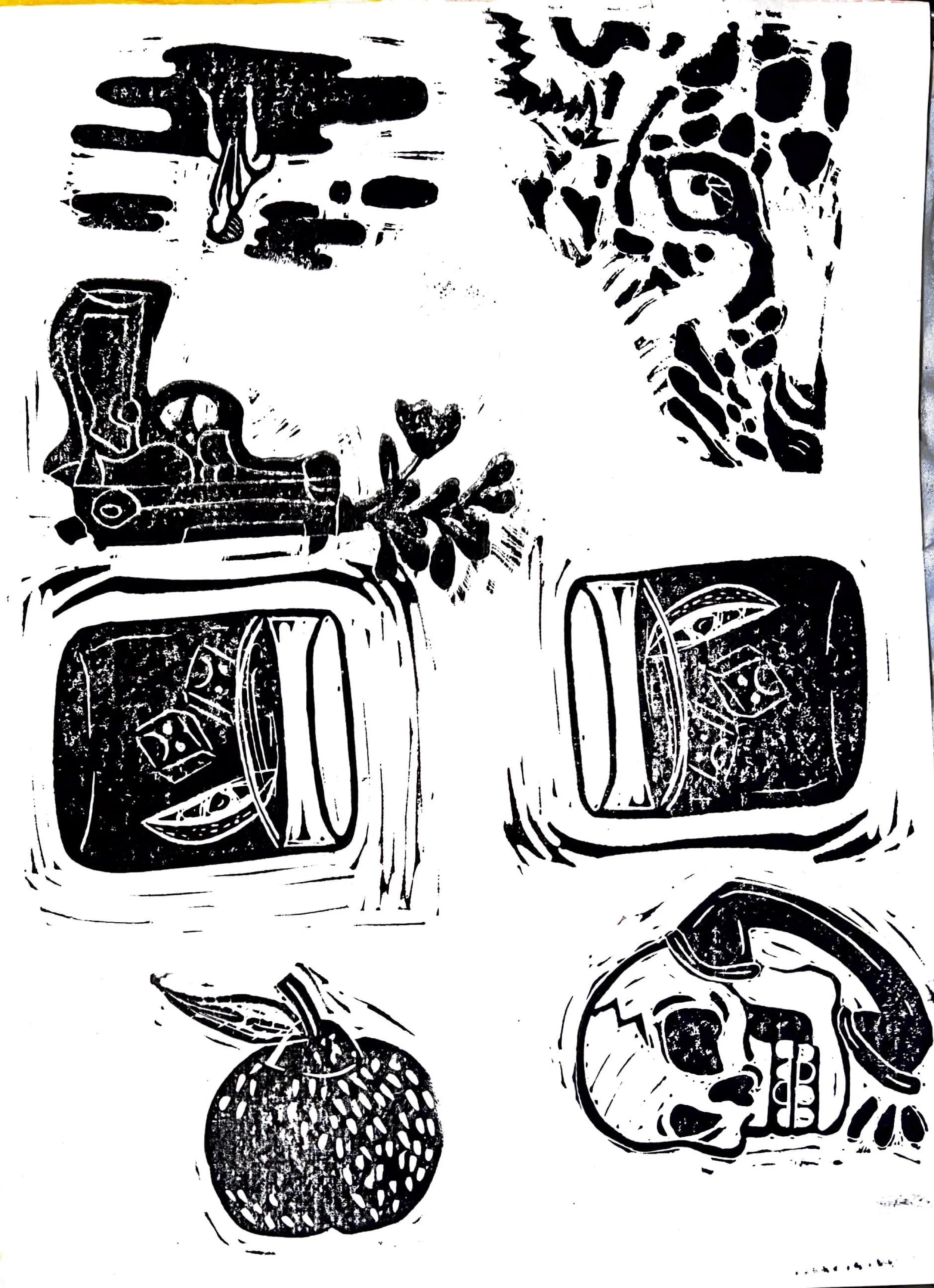
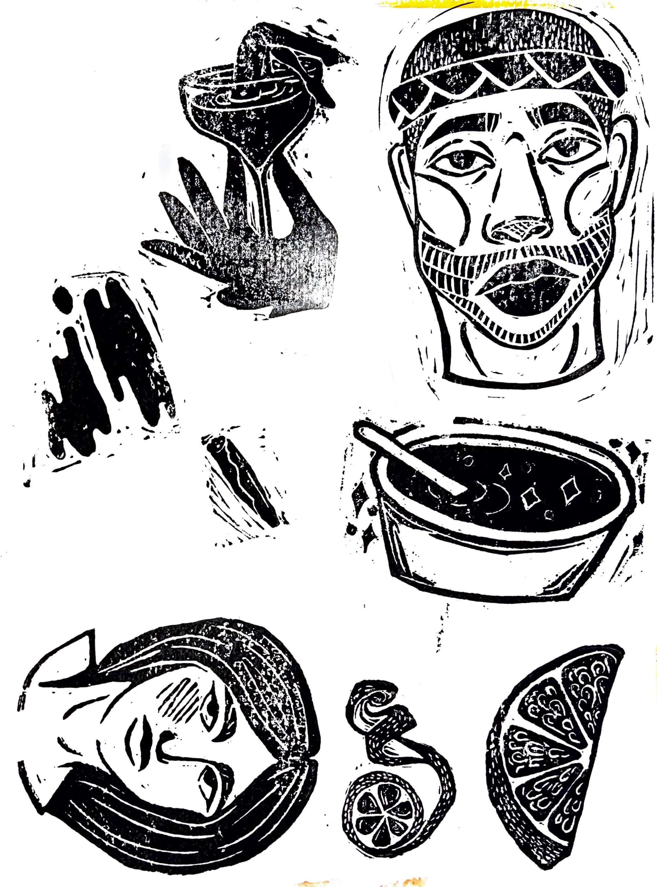
I wanted to focus on the importance of feeling through music for this project, and in order to do that I became fully immersed in the meaning behind Ocean’s lyrics. Each song featured in the album is accompanied by its’ own unique stamp. In this video, I am beginning the first stage of relief printmaking, where you begin with your image and transfer it to the linoleum or rubber block.
In relief carving, you can make your imagery one of two ways, by carving a negative or carving around your line work to create an outline. In this video I am currently carving around my linework in order to obtain the detail I’m looking for. In this step of the process, the depiction of your work starts to evolve.
The surface of the block is inked using a dabber or a roller. A sheet of paper is then placed on top of the block and vertically pressed against the surface; this can be done by hand or using a printing press. In this step, the image is inked and printed multiple times to create the perfect amount of texture.
Considerations and thumbnails
With the printmaking process, multiple relief stamps are made of the same image in order to achieve the right ink consistency and detailed look. For this project specifically—I wanted to keep the rough movement of the ink around each stamp to continue the feeling of an unconventional image. Below are my thumbnail process and three pictures depicting the stamping progress, showing my drawn image, the transfer and outline, and then the final print. In order to make sure that all details and linework transferred digitally, I made the decision to ink in black. When each image was scanned in the contrast of black ink on the white paper helped to pick up all details and then easily manipulated to the Zine colors.INITIAL SKETCH
TRANSFERRED TO THE BLOCK
CARVED THEN STAMPED
Typography and colors
Legibility was the biggest concern for me when creating the type choices. I wanted the consumer to understand and feel the texture of the imagery—also carried on through the text, so looking for a header and body copy type that fit into both of those categories was essential. For color, monochrome orange was chosen to keep it simple yet meaningful to the album to not overwhelm the viewer and to keep Ocean’s initial meaning behind the album name and color through his grapheme–color synesthesia, where he had perceived the color orange during the summer he first fell in love.

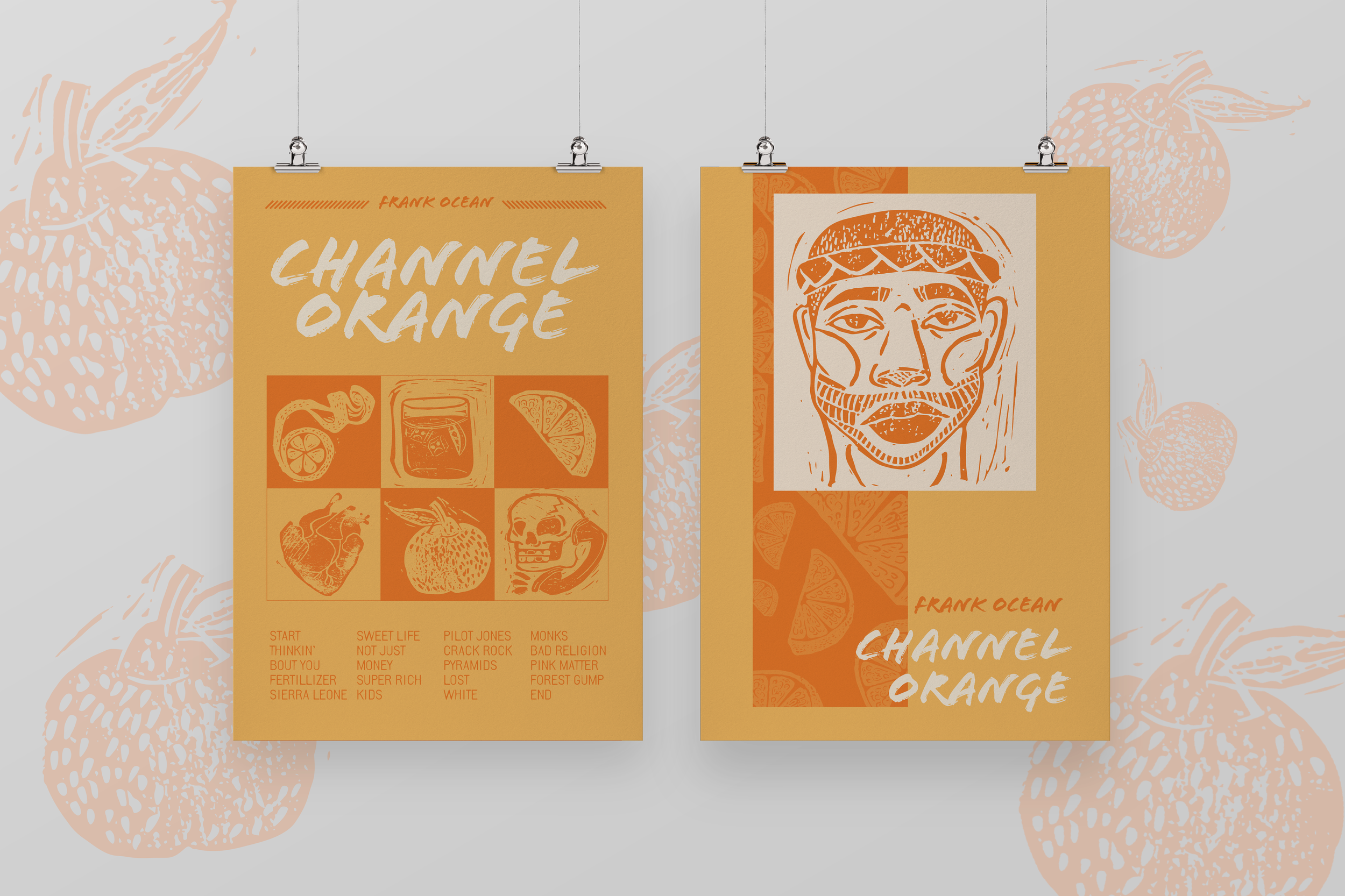
Posters
I wanted the matching poster series to incorporate the same tone and imagery as the zine without copying the layout of the pages. Using color blocks within the same layout helped to differentiate and keep the feeling of a stamp. Below are my initial thumbnails followed by the finalized posters. THUMBNAILS
FINAL POSTERS
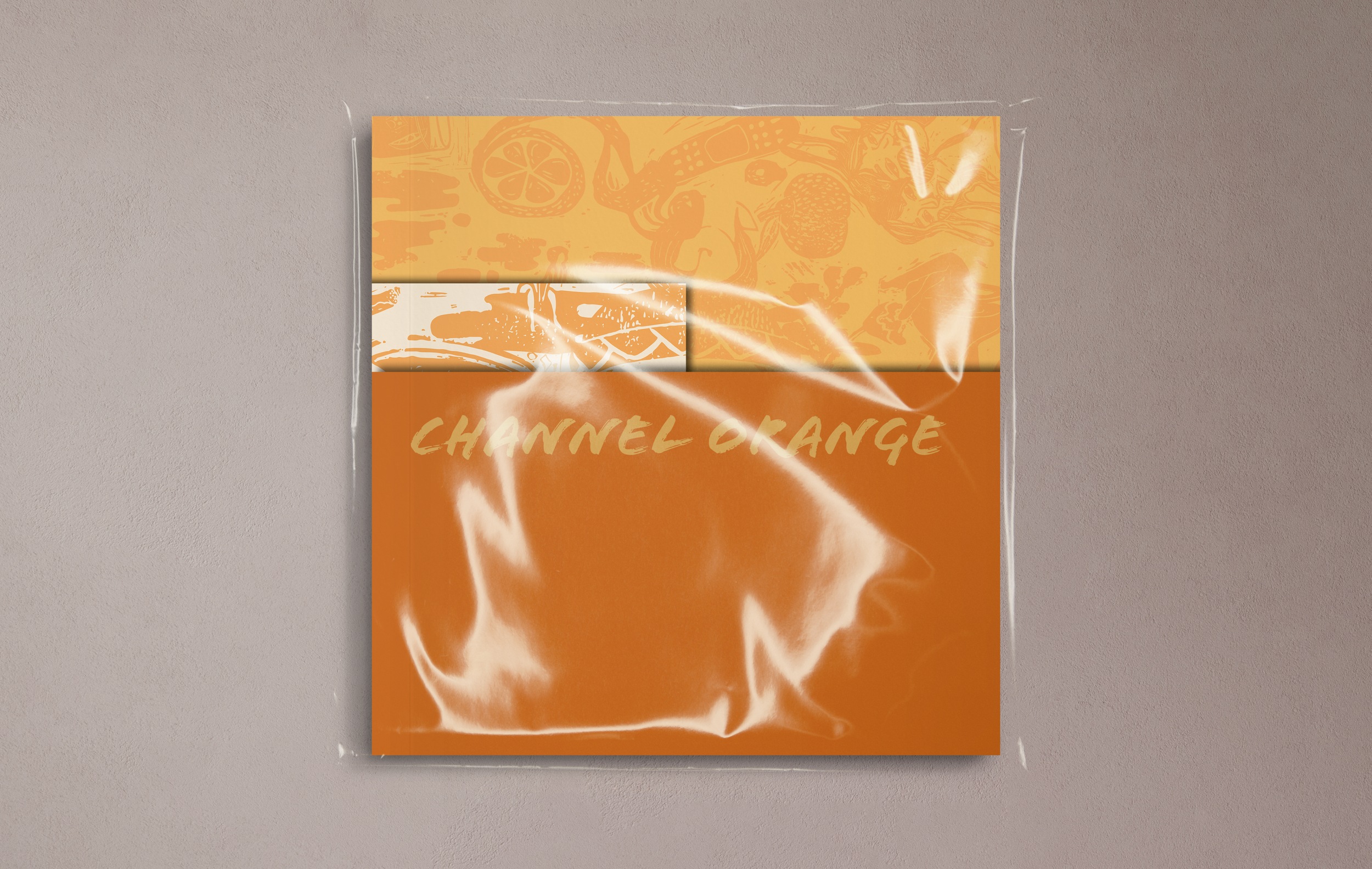
Vinyl record
With the repetitive aspects of color and imagery throughout the entire project, I wanted to keep the vinyl looking more soft and approachable, but still capture movement through imagery.The zine


The booklet


