Broadwing
Botanical Gin Packaging
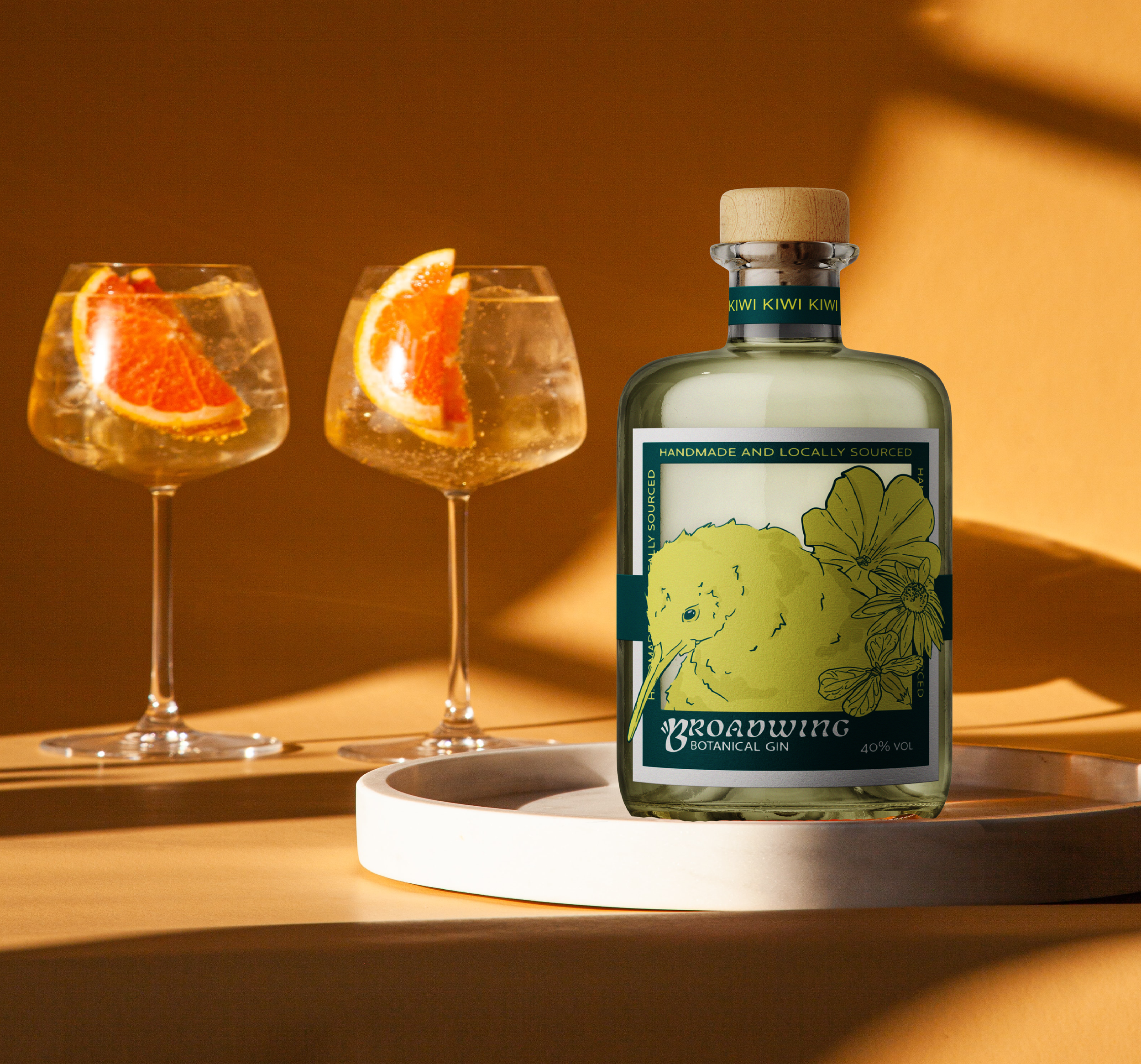
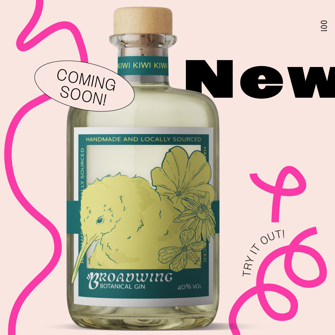
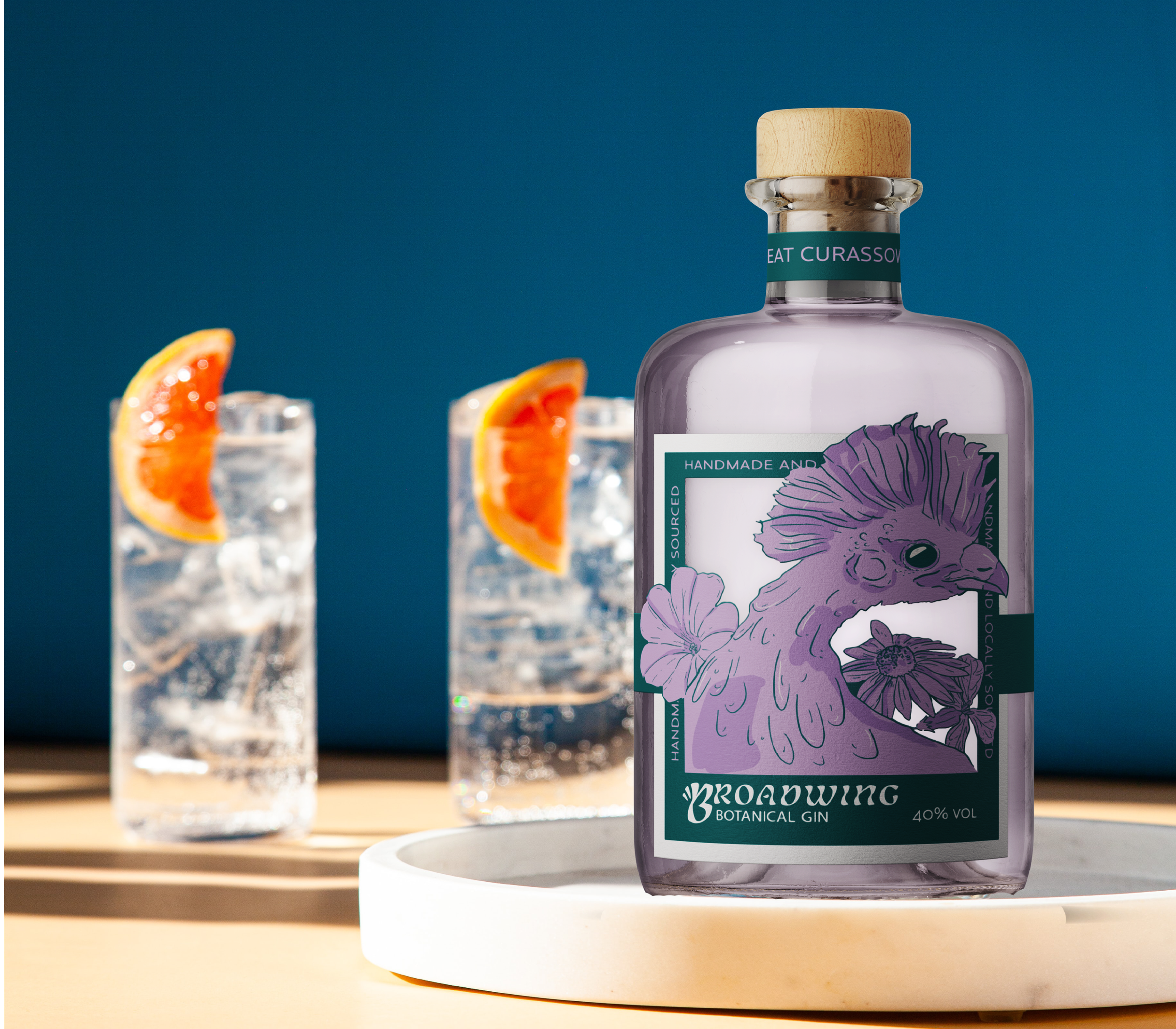
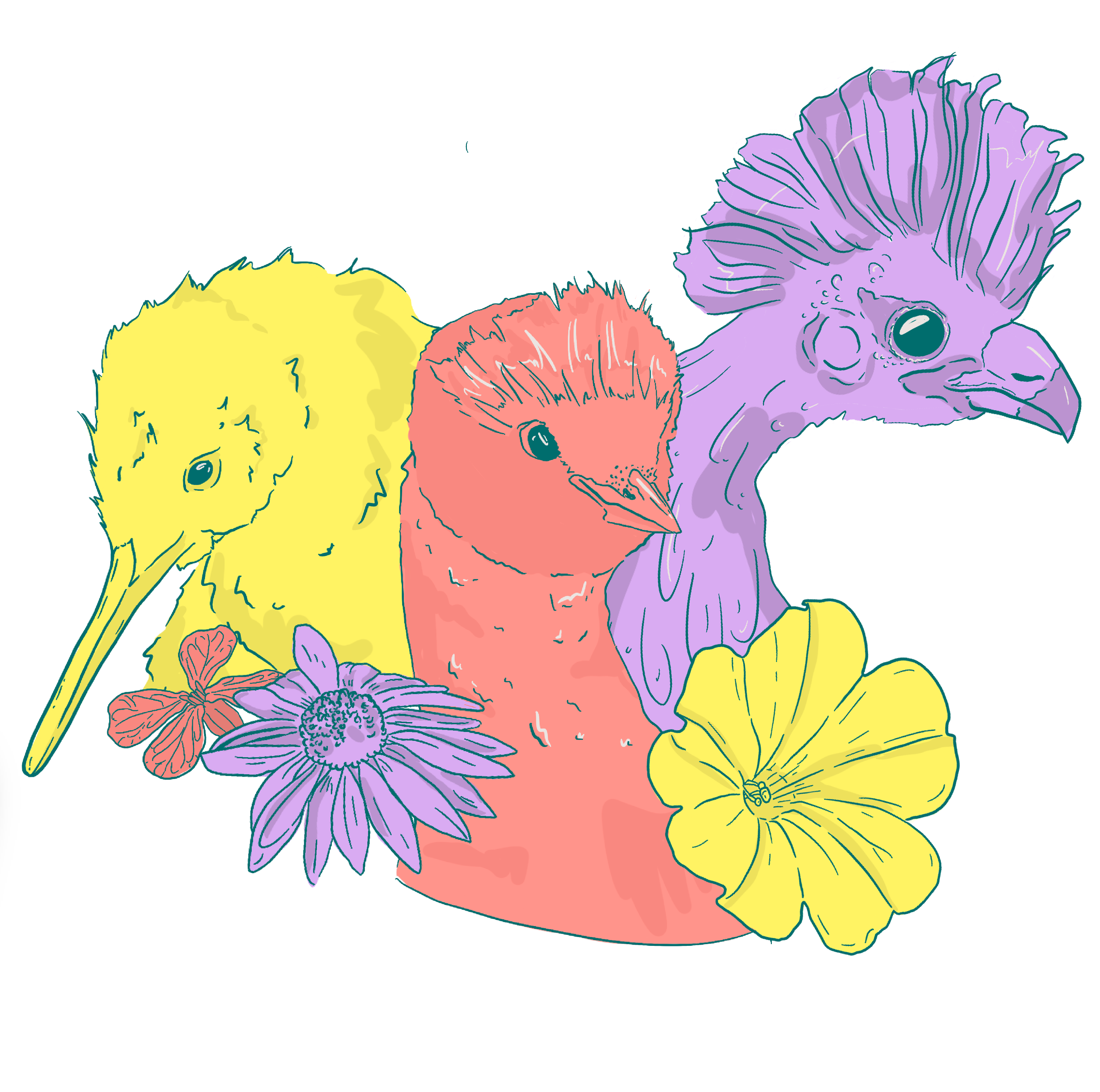
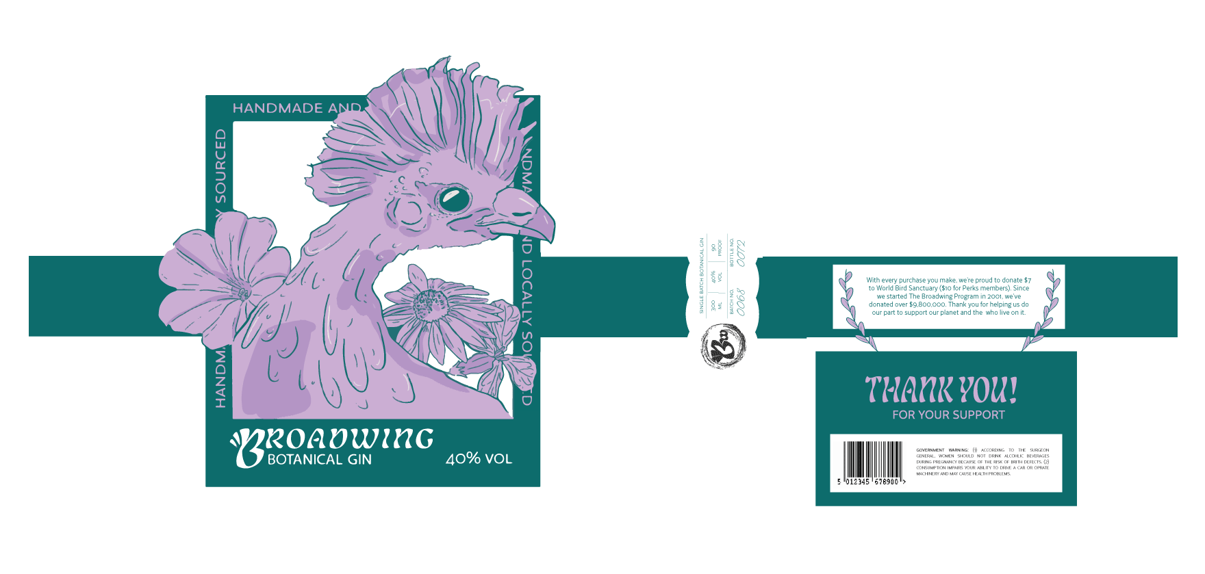
Inspired by botanical spirits, Broadwing Distillery is a fictional branding company that’s main goal is founded on protecting endangered bird species. 50% of the profit made goes directly to birdfund.org, as each bottle displays a unique illustration of an endangered species to grab viewer attention. THIS PROJECT WAS HEAVILY FOCUSED ON WORK IN ADOBE ILLUSTRATOR, ADOBE INDESIGN & ADOBE PHOTOSHOP
WHILE USING PRINTMAKING AND FINE ART TECHNIQUES
The logo
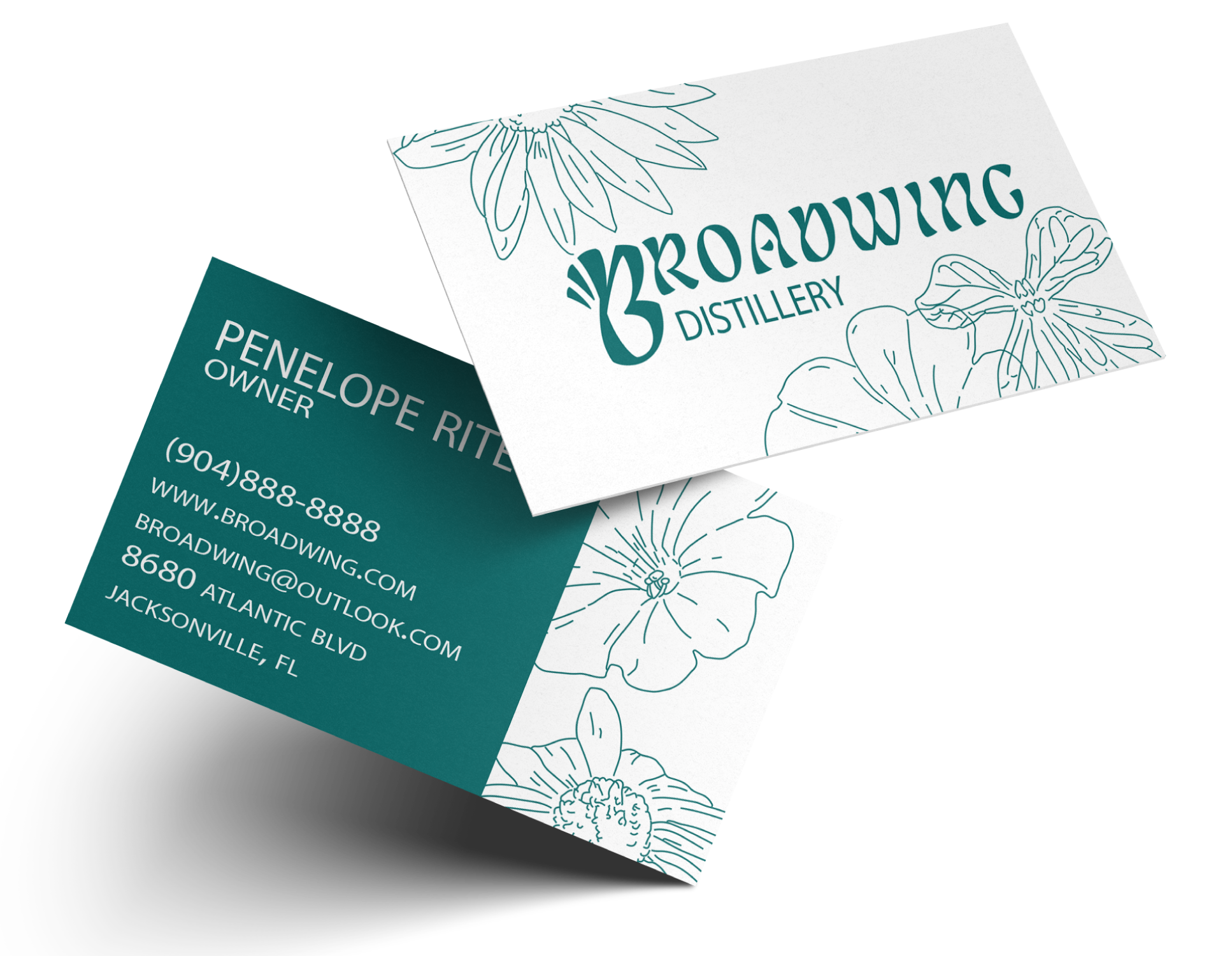
For the logo, I didn’t want it to take away from the heavily illustrated labels—so I decided that a wordmark would be best. The logo was also manipulated to create movement at the letter “B”, representing a bird wing and it’s flapping motion to keep it unified with the brand as a stand-alone logo.Typography and Colors
The primary typeface used was chosen and manipulated to continue to give the brand a organic yet light feeling. Since it is a line of botanical gin, I wanted to incorporate the aura of botanical tasting spirits by bringing in curvature and nonintrusive linework. The colors are an array of cool pastels that vary between bottles, this gives the line more leniency to create more artwork. 
HEX: #f6998f
HEX: #cbadd2
HEX: #086b6c
HEX: #fcf07d